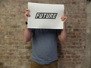
This assignment was difficult for me. Here’s the brief:
This week you’re going to design a word. Pick a word and make a typeface around it. The important thing is that you draw the letters using some kind of rule-based logic. Look at the examples I showed in class, and try to come up with your own typeface system – even if it’s very simple. Your goal is to convince me that you can make a typeface that is better constructed in code than in Illustrator.
So I started thinking about what I wanted to design and decided that I needed more constraints. I chose to make my font using negative space – designing around the letters instead of designing them. I took the visual of an audio equalizer as a loose inspiration.

I chose the word “FUTURE” to design since I wanted my type to look modern, clean and, well, futuristic.
I started creating my system of letters. Each letter consists of 3 columns and each column consists of between 2 and 4 bars to create the negative outline. I then drop these into a vector with a column of space after each one.
At this point, it looked like something I could have very easily done in Illustrator. It just looked like a kinda-crappy pixel font. But since I had set up the letter system to be dynamic, I was able to play with the weight of the letter, the height, spacing and angle of each column. I liked that I was able to adjust the properties easily.
Overall, I think it came out ok. I had a hard time with this assignment and I’m not sure the final output is really indicative of the work put in. But I like the grey on grey in different shades.


Leave a Reply