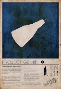
Our first Assignment for our Visual Language class is to identify an example of design that we enjoy and then analyze it using the design principles we learned in class.
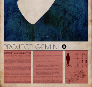
I love the minimalist posters created by Justin Van Genderen. (more here) I had seen these before starting this class, and only knew that I loved the simplicity and cleanliness of the design. After analyzing them more deeply, I see that he’s adhered to many of the design guidelines we discussed. I like all his sets (especially the star wars and space series) but for this exercise, I’ll focus on the Space Race – Astronaut series and this photo of the Gemini project:
Color
Color was used sparingly and thoughtfully throughout the design. There actually is very little of it. The background of the main image is a dark blue that looks a bit transparent, allowing the texture of the background to come through, almost as if it was screen printed onto the paper below. The texture of the paper is also interesting, lending an aged appearance to the entire work.
Typography
Although I couldn’t identify the typefaces used in this poster, it looked like there were only 2 used: 1 for the title “PROJECT GEMINI”, and another for the body. The heading for the body text looks like the same font as the body, but just bolded. (EDIT: Whatthefont.com identified the title as ITC Avant Garde ExtraLight, though the body text was too small to analyze) This is something that I learned from our first class on the principles of typographic design: use only 1 or 2 fonts max. I’ve fallen into this problem before, thinking I need many different fonts to look interesting. I definitely see that keeping it to 2 has the desired clarity the designer was looking for.
Layout
I was surprised to see after I started drawing overlays that his columns were not quite the same width. What was consistent, however, was the whitespace. The gutters between the columns were the same size, and there was a consistent border all around the poster. I also really liked the fact that the space capsule itself is made using negative space.


Leave a Reply